
Web Design
The Brief
To design and build an online identity that can present a portfolio of your creative practice. It is crucial to consider who you might want to view this portfolio and what you want to achieve from it. Think about which design companies and potential employers might be among your users. You will be encouraged to create an experience for the user that expresses your position as a designer/creative but also allows the work to be viewed in a navigable, interactive and online space. The website must also include an ‘About Me’ section.
Wireframe & Content
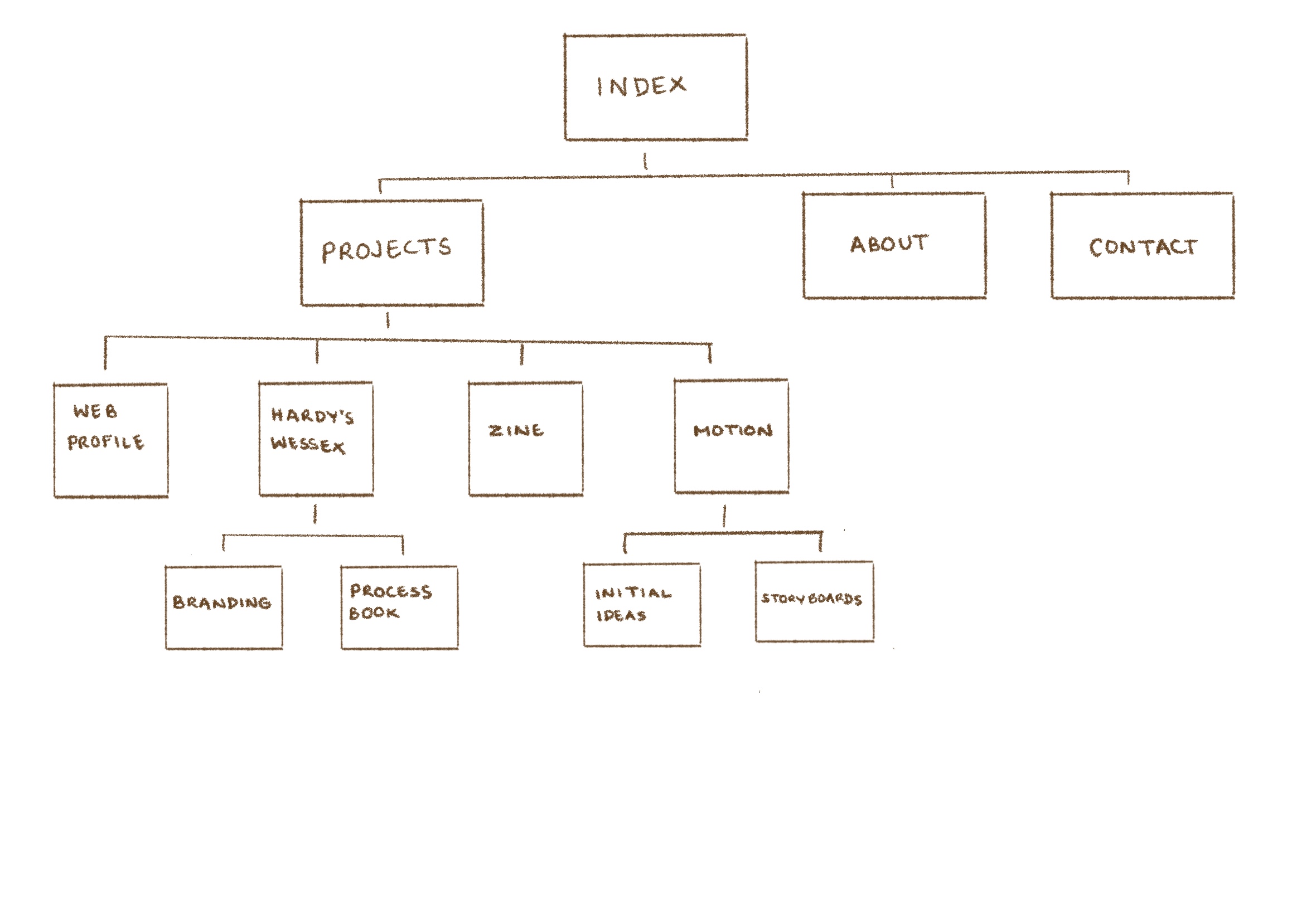
During the first week, I attended the wire frame workshop, where we worked in small groups to pick and analyse the structure and navigation of a website. From this I learnt how wire frames of certain websites have changed throughout the years. For example, Moving Brands is a very responsive website. Every year a group has chosen the Moving Brands website to analyse, before the pandemic their website was highly responsive through videos, after the pandemic they have added a sustainability section.
From this I got a better understanding of the importance of navigation on a website, and I knew that I wanted to keep mine minimal and clear to tell the story my projects and myself. I visualised this through sketching my wire frame and planning the content to fill the website with.
Research
As coding is a new skill for me, during reading week I learnt the basics of HTML/ CSS through Free Code Camp tasks. For beginners was a good way to understand the basics, as it visually shows you the output of the code you have just inputted. In addition to using websites, such as; W3 Schools, Youtube and FireFox Developer, to learn and discover new code that creates the visual web design I intended for.
During the first few weeks I looked at many websites for inspiration and created a pintrest board of colours and styles that appealed to me.
Most importantly, the web design should create an experience for my users. Therefore, I needed to identify who my audience is. Which I was able to through the only workshop 'Copywriting support for 'ABOUT ME' section of website portfolio.
Layout Design
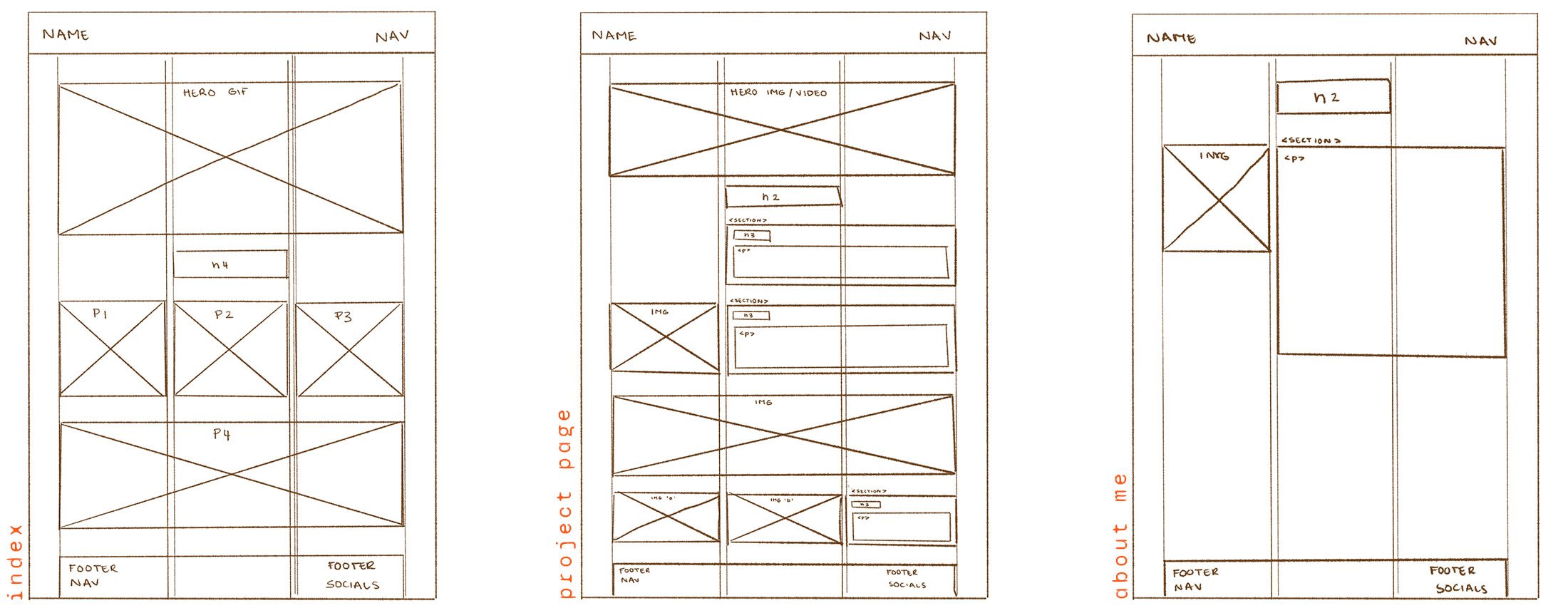
After selecting the content to feature of my website, I then planned how my pages would look. I began with the main pages; index, about me and project page, this made it easier to translate into a digital/ responsive data, as well as see how to use css grid.
Content Structure
For my project pages, I did a similar method as my layout design to consider how I could distribute the content out on my project pages. This enabled me to envision the flow of the information and how to structure it with css.
Having a clear structure will aid the user to see the design process of each project. Ensuring that they are not overwhelmed with large sections of text by having a mixture of large and smaller images in sections to break up large sections of information.
Typography & Colour
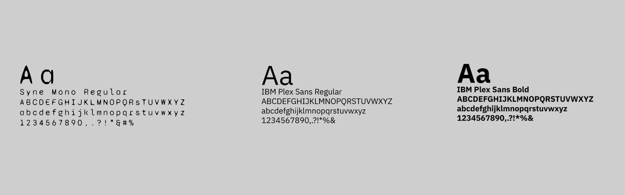
I used typography as a tool to emulate my graphic style but also be legible and clear for the user to read. I used Syne Mono for my navigation bar and footer and IBM Plex Sans for large sections of text and headings. I used a simple colour scheme with pops of colour, that my friends associate with me. I kept with a white background, rather a light shade of grey, as most of my images are scanned and I liked the look of the background of the images blending in with the background, rather than it being contain in a box.
Hero Image
For my home page, following the new skills I learnt from motion, I created an interactive gif that links to my 'About Me' page and sets the tone of my website. As I like working with analogue techniques, such as sketching and collaging, I wanted an icon that will showcase that style and my graphic personality.
Navigation & Scalability
The navigation bar and footer creates categories for content to be organised in, as well as make it easily accessible for the user.I did further research in creating a "back to top" button, within each project page, which when clicked jumps back to the top, instead of having to scroll back up. In addition to a "back to projects" and "next project" to smoothly move through the website without having to do excessive scrolling.
I researched into responsive grids by watching videos on youtube and attending Mark's studio workshops, as I wanted my web page to be browsed on most devises and still have a structured/ clear layout.
Coding Process
I coded my website through BBEdit and found the whole process an endless loop of hit and misses. I used Mark's template folder to add all my content in, then added my own code to adjust it to my own visual style and layout.
User Testing & Feedback
My first prototype of my website was all coded by myself, as I wanted to challenge myself and give coding a good go after learning and understanding the basics of HTML and CSS. This version of my website was shown to the class, which has many complications. The css grid for my index page didn't work the sizing of my images and videos for some sort of reason, which lead my index page to scroll side ways, rather than downwards. Surprisingly, I had positive feedback from my error as my peers thought it made it more unique compared to other websites. In addition, really liked my hero gif on the home page, as it showcased my personality.
Evaluation
Overall, during this section (showcase) of Narrative, Sequence and Interaction I was exposed to a new skill set that has enabled me to explore a new way of working within graphics. For instance, using code to create a platform to showcase my work to potential clients in the industry. I feel fortunate to have the opportunity and time to actually learn/ use code, as it was a skill that I wanted to have and maybe take on further. However, learning how to code and produce a website out of code in such a short time was very challenging, and at times felt frustrated with things not working how you intended it to when trying to imply code to create a digital visual.
For instance, the starting point was very slow. Even though, I understood the importance of planning the content, layouts and structure on paper before hand would make the digital process much easier. The in between stage of from sketches to coding the structure on BBEdit was hard to find the momentum to start, which was frustrating with the little time we had. In addition, I wanted to challenge myself with the new knowledge that I've learnt and try to code my website myself from scratch. In some cases it did work, but in others it didn't; creating problems in how my css grid worked on mark up. I wasn't fully advance in this sector to know the slight changes I would need to do to make it cohesively to work.Therefore, I decided to use Mark's templete in the end.
In the contrary, I felt quite constricted in Mark's template in layout my work, therefore I added my own code that I've learnt/ researched into (from youtube and W3 Schools) to make the website more my own. In addition, I also enjoyed the process of creating photo/ video content specifically for the web, such as gifs, as it adds more interactivity/ movement to the web page.
Looking back on how I delt with this project, I would improve my time management and pace in which I completed individual elements, to be able to have enough time at the end to play with the interactivity and visuals further, i.e; learning and trying how to do the hover title feature over photos and have the text smoothly pop up onto the page once you scroll down (inspired by a current graphic design student: Christ Fassoli).
To conclude, I really enjoyed the process of code and am pleased with the final outcome of my website. I found a new admiration for coders and their patience, and can see the significance of the new digital world in design.