ZINE
I created Pedro (zine) during first year graphics. The aim of this unit was to build a body of work/ content that will form the basis of our main design project, a zine. This unit considers the nature of typographic hierarchy, the conditions that govern its application and the principles of organising editorial information within a creative frame work.
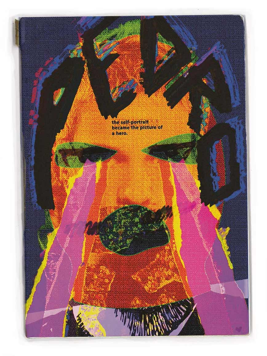
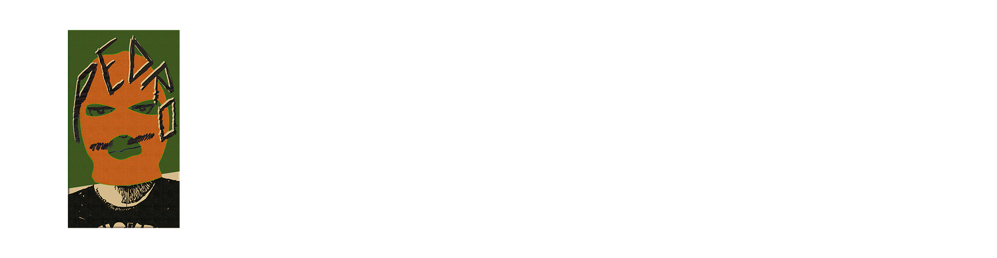
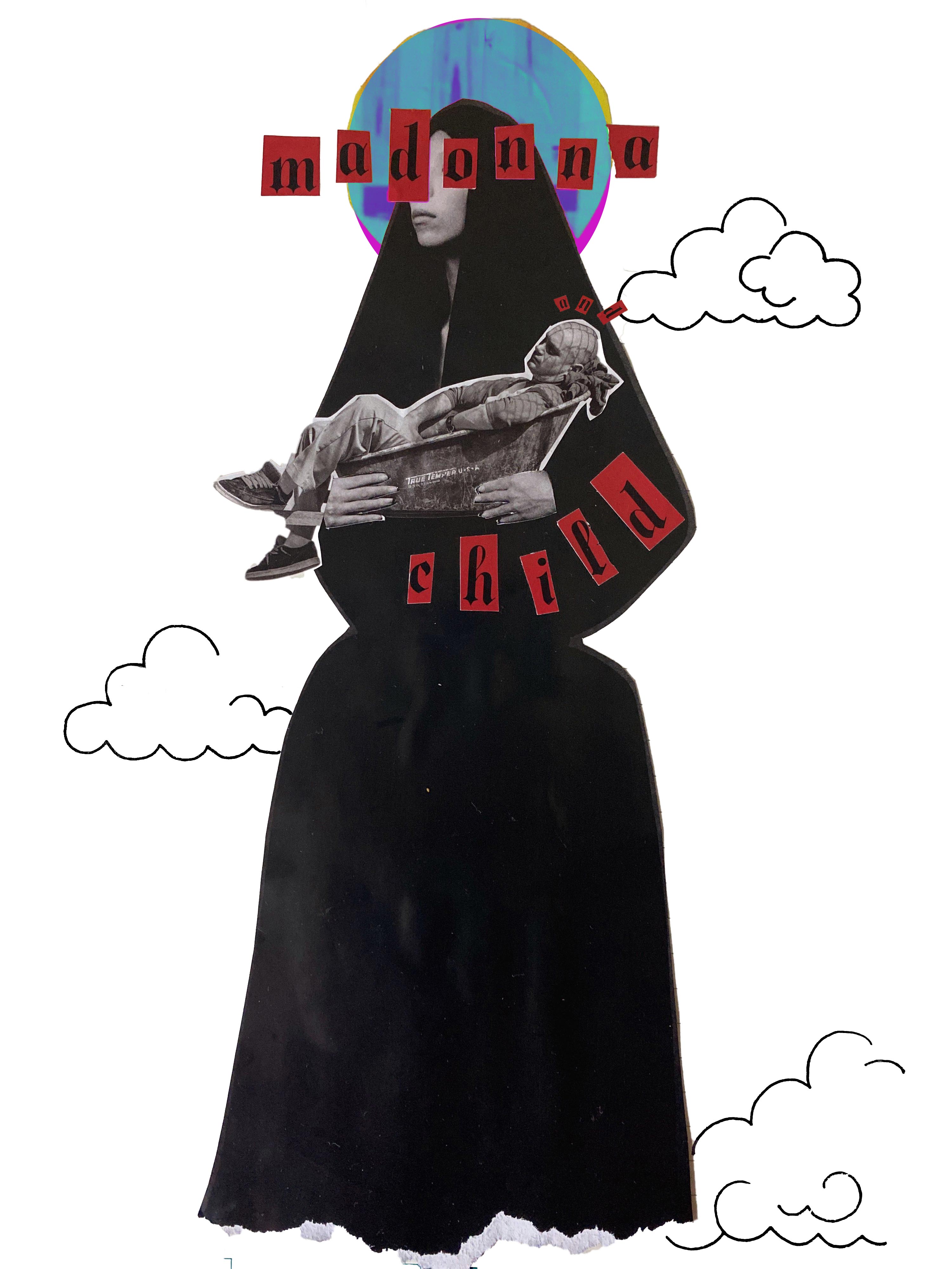
The Masthead
Why Pedro? We were all given the name of our zine through a random generator, luckily I got the name Pedro. I was able to create and develop this masked character, which enabled me to visually experiment with layers, textures and colours.
I was highly inspired by the Post Punk movement, i.e James Reid, as well as the grunge aesthetic.
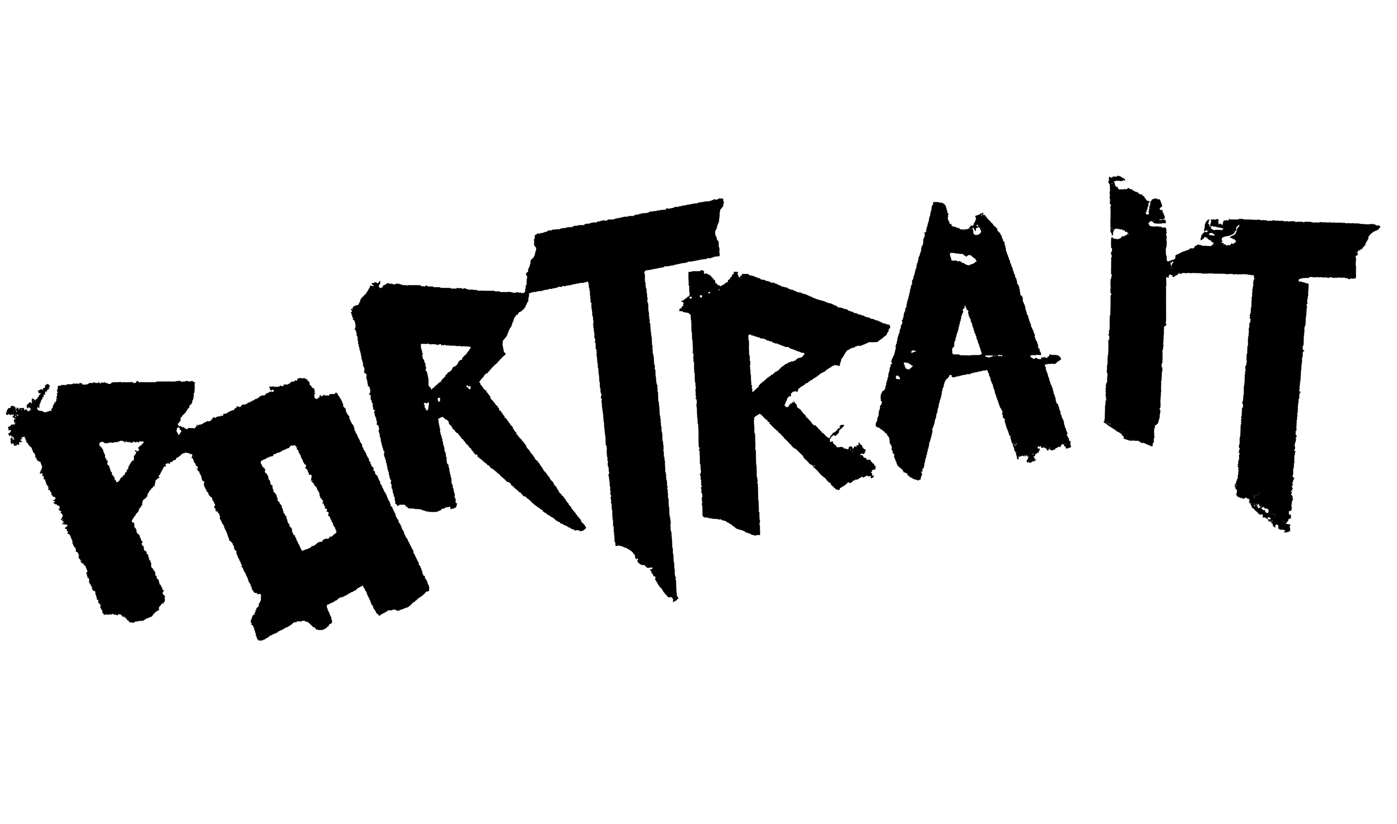
I layered my raw collage with my digital collage with different layer effects to create the final image. The masthead typography was done by hand with a permanent marker and was layered on top using photoshop.
The Back Cover
I turned one of my notebook doodles into a pattern, which I used for the back cover of my zine, Pedro.
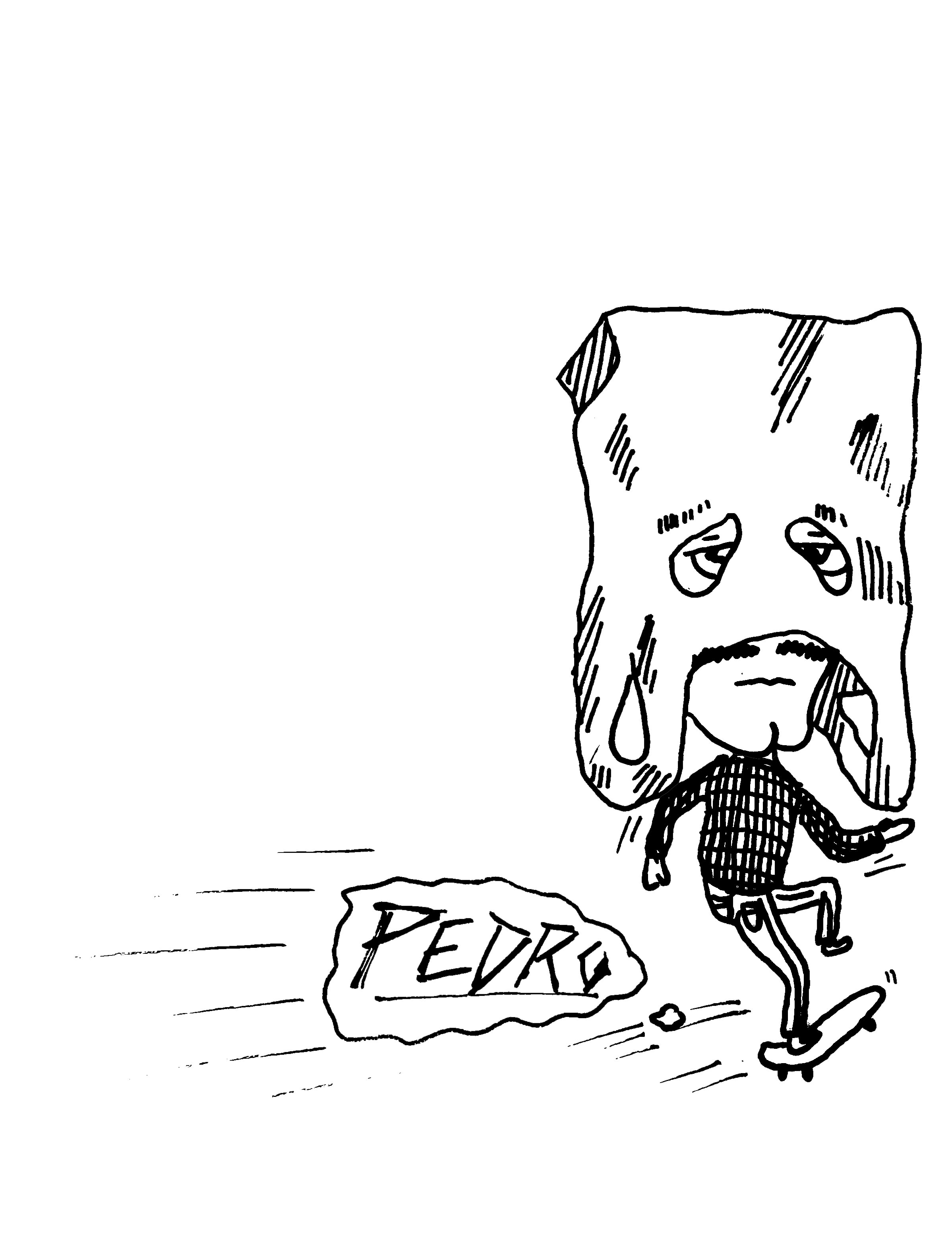
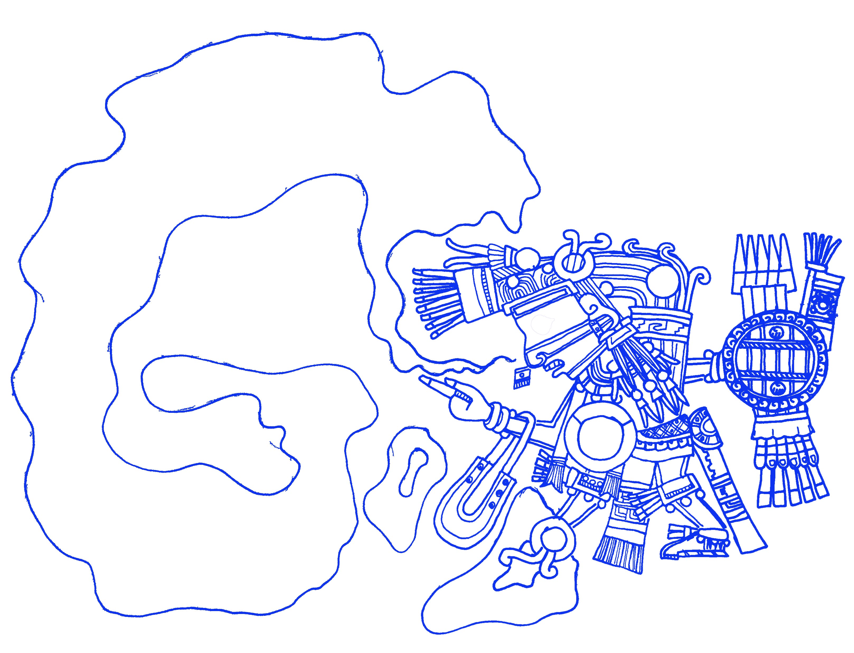
Doodles
I did many of my own doodles for the zine, which I took inspiration from sections/ quotes from the text given to fill the zine.
Most of the illustrations were done by hand, then digitalised on illustrator.
Collage
As I had creative freedom building this zine, I used many analogue techniques; collaging, with magazine I had around to create the visuals shown throughout the zine. This creates structured randomness and texture, that establishes the overall style.
Typography
I exposed to many experimental typography workshops, which lead me to create type with tape I had lying around and magazine lettering. Being able to create my own typography, enables me to match the texture style of the visuals.