Branding: Live Brief
Required to design a graphic identity for the Thomas Hardy Exhibition that embodies its principles, values and motivations, whilst leaving a memorable impression.
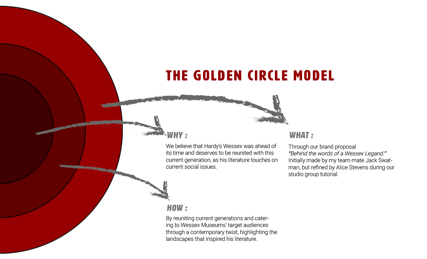
The curator’s aim is to make the exhibition feel relevant and contemporary whilst reflecting the needs and interests of its audiences both current and future. It is crucial to fully understand the ambition, scope and aims of the project as well as the intended audiences. The exhibition needs to appeal to Hardy lovers and the local community as well as inspiring a new generation to find relevance in Hardy’s writing today, therefore consider a target audience within an age range of 18 – 35. Harriet Still, Thomas Hardy Exhibition Project Curator and Cathy Lewis, Wessex Museums Head of Marketing, will be at the project launch to talk about the project and answer any questions. They will also provide feedback at the interim critique and final presentations.
Wessex Museums have already commissioned Robin Mackenzie, a local printmaker and illustrator, whose work frequently explores the Dorset landscape, to create a map that will be used in the exhibition, possibly to cover a wall, but may also be used for merchandise such as an A6 postcard. The map on the following page, created by Robin with hand cut lettering, shows the general visual language that Wessex Museums are intending. The old map, below that, is Hardy’s original Wessex map that Robin will be using as a template. The main thing for you to consider, is that your design must visually complement the work Robin creates.

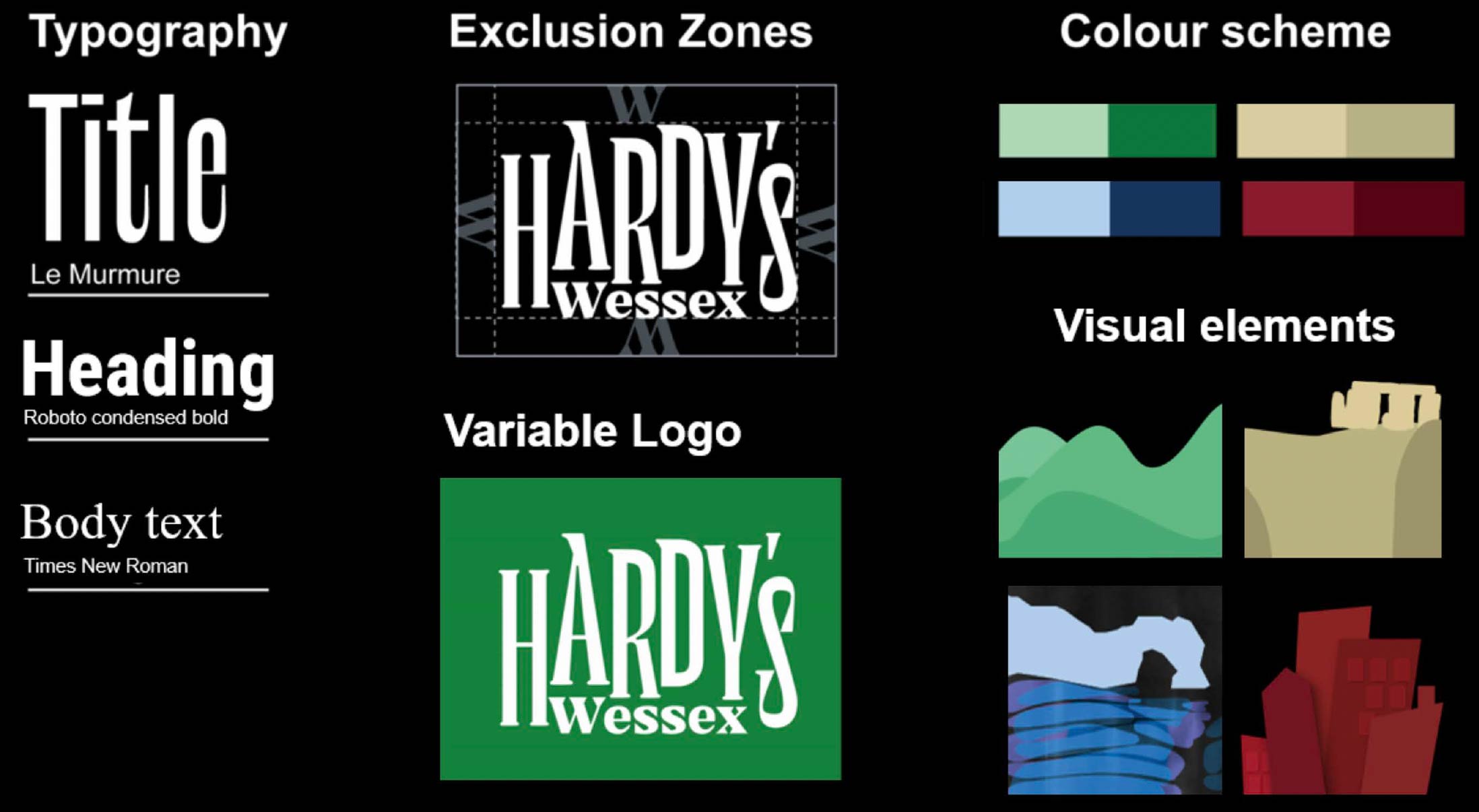
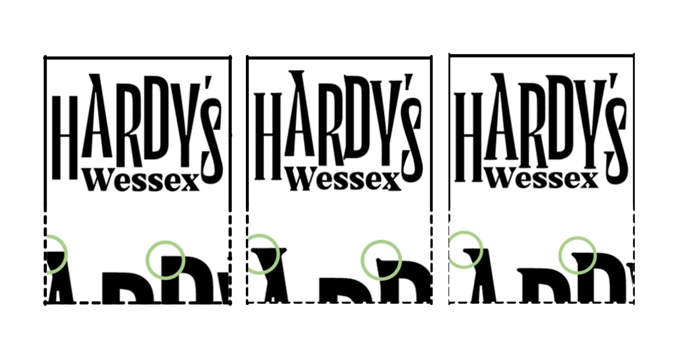
The Logo
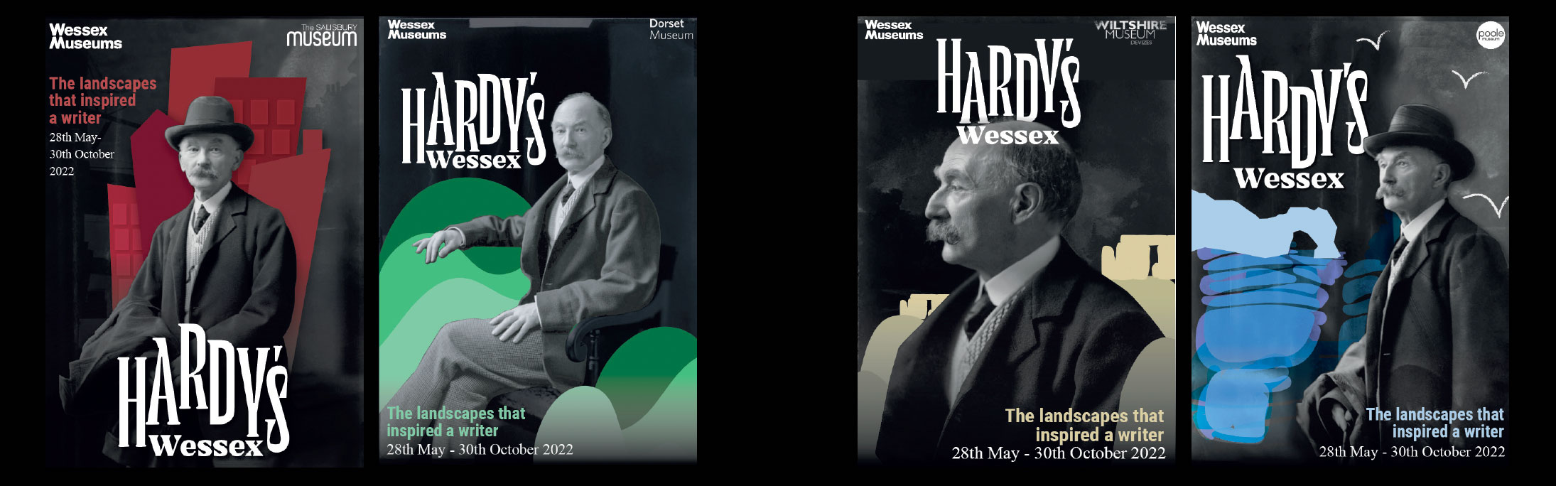
We designed a variable type face that reflected the shape of each landscapes within Wessex, i.e: Salisbury's sharped edges (urban), the rolling hills of Dorset (countryside), Poole's smooth waves (seaside), and the ancient stones of Wiltshire (ancient).
For the lead images we kept the designs minimalistic, and more modern, whilst juxtaposing the playful colours and shapes with the black and white imagery of Thomas Hardy. Therefore, we were able to appeal to younger audiences, whilst considering Hardy lovers.
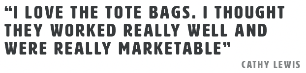
Touch Points
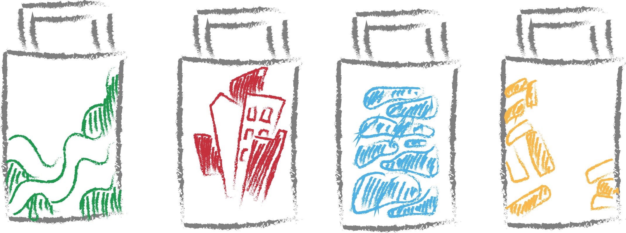
I continued the key visual elements, such as the distinct shapes that represent the character of the 4 different landscapes, into the design of the tote bags. I considered the longevity of the merchandise, and only incorporated the museum logos with the contemporary illustrations, so it remains relevant after the end of the exhibition. Whilst simultaneously giving exposure to the branding of the 4 museums under Wessex Museums.
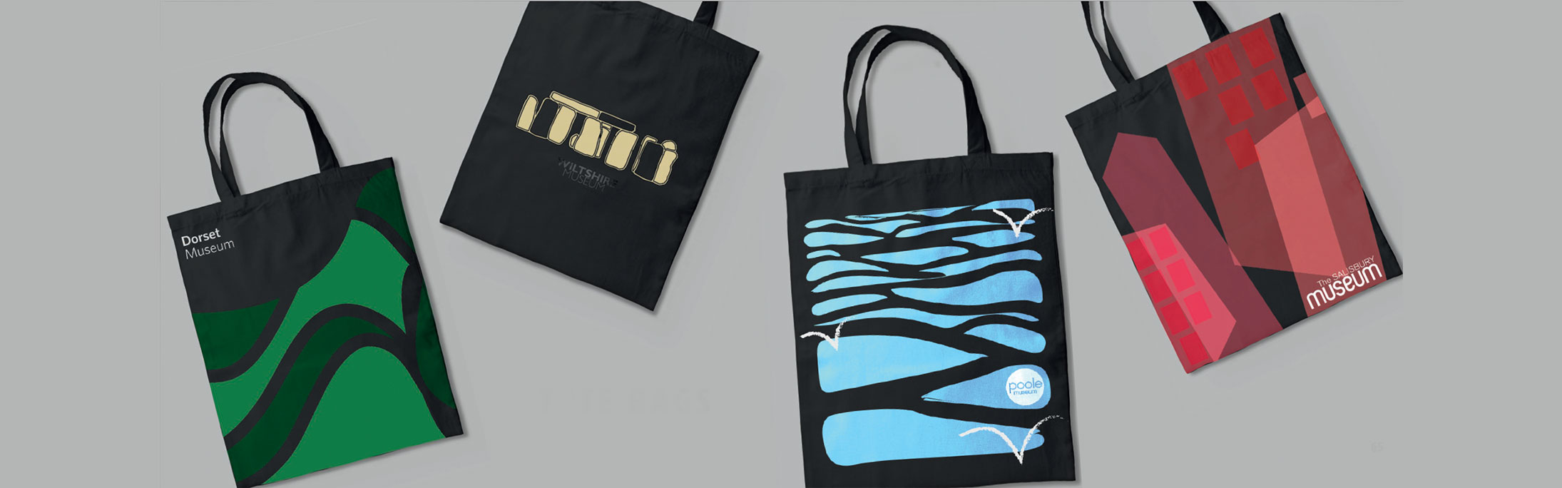
As most of these places are tourist spots; Poole, Wiltshire, Salisbury and Dorchester, I designed Victorian style ‘tourist’ postcards, with a die cut of Thomas Hardy so our target audience can take him anywhere with them in Wessex, and line him up with the landscapes he was inspired by and post onto social media; Instagram, Snapchat or Facebook.