
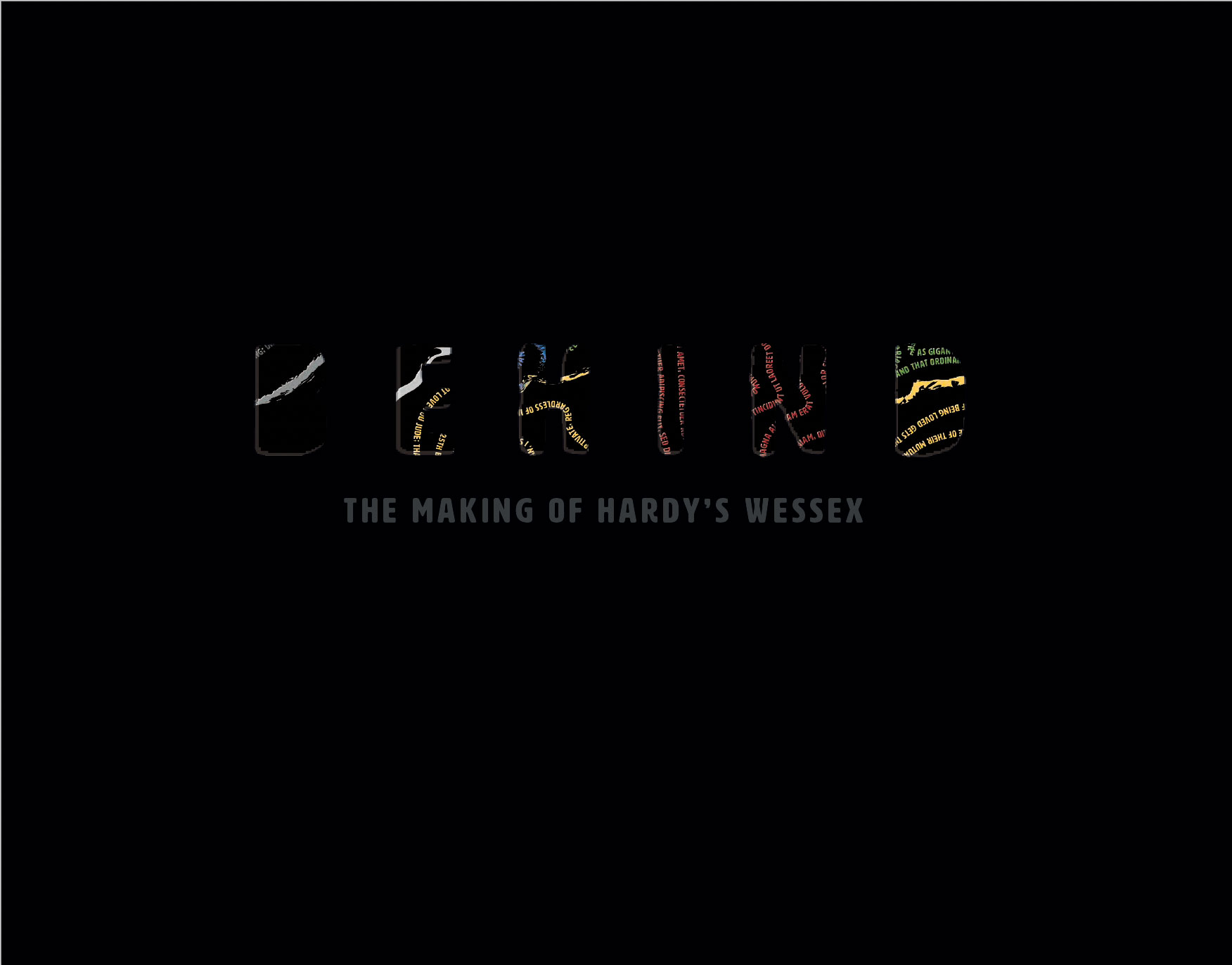
Behind: The Making of Hardy's Wessex
The Brief
To produce a Process Book that communicates the journey of my design process from the live brief in Hardy's Wessex. And must design my own individual book that reflects the process undertaken within the group project.
As well as the final outcomes from Hardy's Wessex, the book should also include the process of designing the actual book and should include the systems I have utilised, such as; grids, fonts, hierarchy and colour. The book should have a minimum of 36 pages.
Book Design
The role of a book cover, originally, was to protect and bind the inner pages together. Now, it's to attract the right reader, make money, stand out from the competition and reflect the content.
Therefore I had to consider:
1)Create a page design: that reflects the content of the book, easy for the reader to follow, by having a clear visual hierarchy. And fits the right number of pages.
2)Create a cover design: that attracts the right audiences, and expresses the right audiences.
Book Size
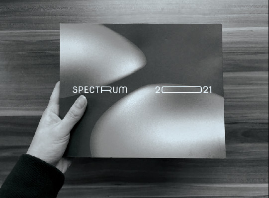
I scavenged around my room for books that I already have, and noted the different sizes,page orientation and how it felt when I held itin my hands. From this research, I discovered that I preferred the books that were horizontal,as it would best fit the images I had to include,as well as it being more satisfying to flick through. There was a range of sizes; from 208x295mm to 156x234mm.
In the end I was drawn to the format of the AUB Spectrum 2021, which is 220x179mm. I added a few more millimeters for my book size of 241x189mm, as I considered how the pages would be binded.
Creating Visual Hierarchy
"Simple, Clean & Clear" - Briony Hartley
The gatekeeper to every book’s consistency. For a better understanding of the grid and how to use it, I read ‘Making And Breaking The Grid’ by Timothy Samara. In the midst of the chaotic grid examples, I went with a simple grid structure.
The Grid & Hanging Line
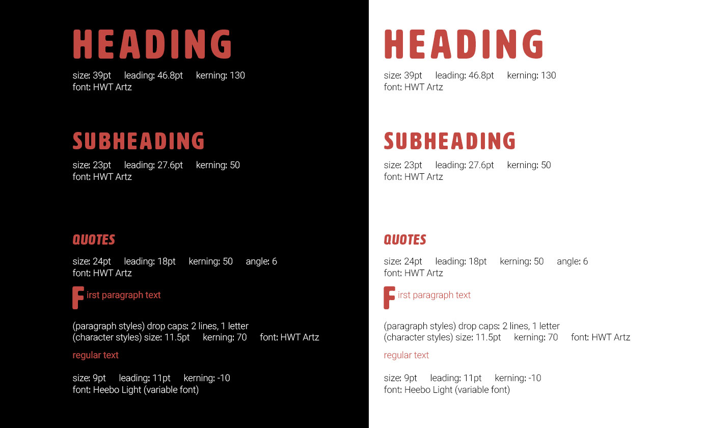
A margin of 25mm for top, bottom and inside. And 15mm for the outside margin. I did a larger inside margin as I considered how the page would look once printed and binded. A simple grid structure of 3 columns with a gutter of 5mm. 2 hanging lines of 60mm for my sub-heading text and 95.2mm for my text, to create consistency all throughout my book. I created a rule for where I place my heading, sub-heading and text within my grid structure.
In addition, created my own grid within the margin to fit a range of photos that I had for research. As well as, a modular grid for when I wanted a more centred layout for text.
Typography
Emphasising visual hierarchy through typography. Through Ralph’s Typography and Grid workshops, I was able to experiment with type hierarchy and how to best achieve it within the grid but as well as breaking the grid.
Subsequently, in Mark’s Generative Type workshop I was introduced to the variable logo, which I found was interesting and useful in my graphic/ type practices. This then made me consider and actually use a variable font in my process book.
Colour
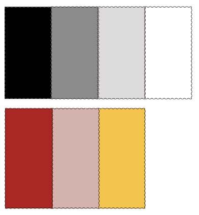
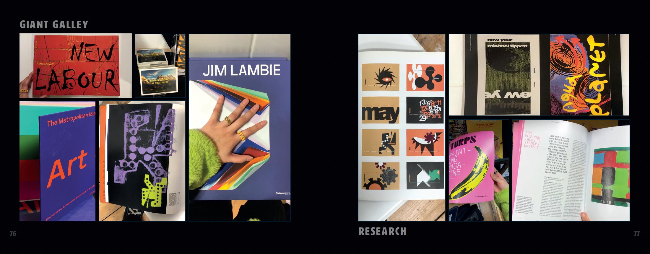
Colour the pinnacle of a brand, book and relaying information. In Briony’s colour workshop we learnt the importance of colour for the identity of a brand and how its used throughout a book. From monochromatic and analogous pairings, to complementary and split complimentary, to triadic and tetradic groupings of colours. The colours chosen create the atmosphere and running theme of any given material. I was introduced to Adobe Capture, which enables me to get swatches of colour from an object, photo, environment ect...
This helped me to simplify the colour palette I chose for this process book: essentially, I was going to continue with all 6 of the colours were used in our brand guidelines; black, white, blue, red, green and yellow, to visually show each chapter. However, after my first few drafts and trails of layout of the process book (shown on the next page), I found that there were too many colours and secondary colours to think about. Personally, I think some of the colours don’t compliment a black background. Therefore, I simplified the colour palette.
Flat Plans
The ups and downs of my flat plan journey. Producing a flat plan was one of the hardest aspects of designing a book. This was the area I spent most on my time on planning, thinking, trying, and changing. In addition, at the start I didn’t have a title nor colour theme that would set me off to a given direction.
The starting point: I illustrated a versatile document to plan my initial ideas and content. I was able to roughly sketch on some thoughts on the pace of the book; positions of text and imagery, negative space and splash pages, on different layers. Which is a more sustainable way of planning as it reduces the amount of paper waste accumulated.
The turning point: after placing a few photos, I found that my initial format to showcase large amount of images on a double page spread, was too messy and didn’t work. In the end, I selected a few photos, varied the sizes and created a grid from that, which would be applied to my other double page spreads that would contain a sum of photos.
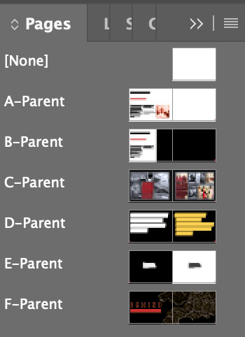
I created my primary layouts and planned each page out specifically on parent pages to produce a digital flat plan; accumulating 36 parent pages. However, as I started to edit onto the each individual parent page, I soon realised the struggle and inconstancy it created. Mid-way through editing nearly half of my file, I noticed how the position for the sub-heading and text weren’t consistent throughout the book, as only set in place the rule of the heading hanging from the top of the margin, and the sub-heading hanging from the hang line. This caused the space between the sub-heading and text to increase through the book. With a week left until hand in, I was debating on whether to start from scratch again.
To settle my perfectionism, I took the risk by starting from scratch on a new InDesign file. I went through my old process book layouts and picked out a few layouts that I thought really worked well with the information and images. I went from having 36 to 5 parent pages, this decision helped execute the consistency needed in my book.
The Book Cover
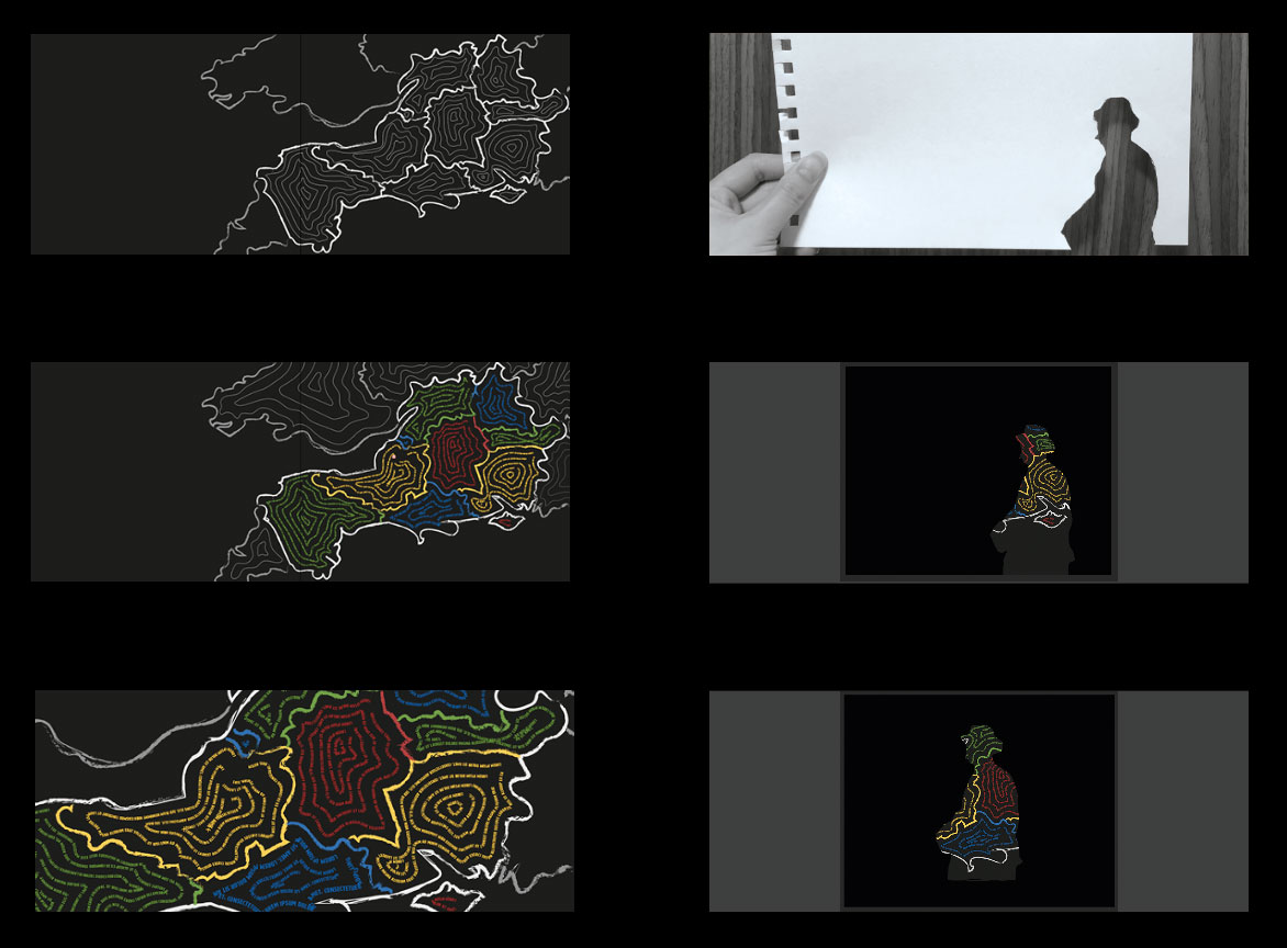
I wanted to incorporate Wessex visually in some way, as the links to the brand proposal. Inspired by Paula Scher’s Maps art/ graphic collection, and by Harriet’s talk on Wessex in Hardy’s eyes; showcasing the unique names Hardy has given to each area. I thought I would put my own twist to Wessex and try to combined both Thomas Hardy’s famous quotes with the map of Wessex. I filled each of the distinct areas of Wessex with contour lines illustrated with type.
Testing out the die-cut. I used the image of Thomas Hardy from the Poole Museum poster as my silhouette. Did both a physical and digital trial, using Photoshop’s lasso tool. I was then able to see what it would look like against the Wessex Typographic Map splash page. In the end, I didn’t end up using Thomas Hardy, and went for s simple type front cover. Referring to our focus and use of a variable type and the theme of ‘words’.